Collapsible navigation menu built in Power Apps using flexible height nested galleries. Flyout animation is achieved using a timer to dynamically change the horizontal position.
Menu construction
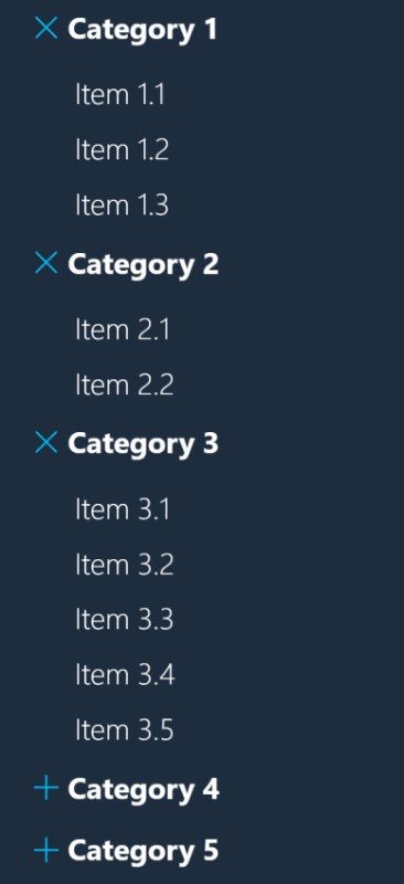
The menu is bult using two nested Power Apps galleries - a parent gallery for the category headers and a nested gallery that contains the navigation items.
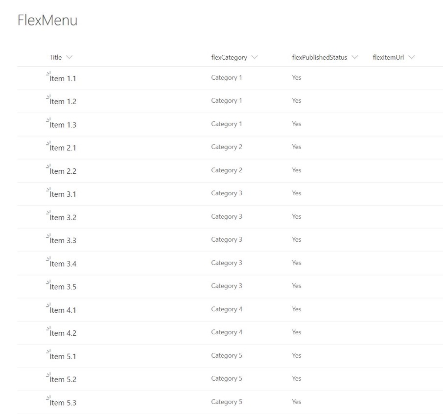
The menu items are populated using the following SharePoint list. The SharePoint list is added to a collection called colMenuList on app start.
The GroupBy function is used to shape the date in the parent gallery. The Items property of the parent gallery contains the following formula:
GroupBy(
    AddColumns(
        Filter(
            colMenuList,
            flexPublishedStatus = true
        ),
        "MenuCategory",
        flexCategory.Value
    ),
    "MenuCategory",
    "GroupByCategory"
)
The formula adds a column to colMenuList using the AddColumns function. We then use GroupBy to group by the created column and name the group GroupByCategory. This group is used to populate the Items property of the sub-gallery (see below)
ThisItem.GroupByCategoryA flexible height gallery is used to control the height of the gallery containing the navigation items. The height is determined by the following formula which is located in height property of the sub-gallery.
CountA(GroupByCategory.Title)*40 * CountRows(Filter(colSelectedCategory,MenuCategory=ThisItem.MenuCategory))The formula counts the number of items under a particular category and multiplies the number of items by 40, which equates to the height of an individual item. So if there are 5 items the gallery height will be 200.
The second part of the above formula multiples the number of rows in the colSelectedCategory collection. The result will either be 0 or 1. This controls whether the category clicked on is expanded or collapsed. See below for how the colSelectedCategory collection is defined.
Collapse/Expand functionality
The following formula is located in the OnSelect property of the parent gallery. The formula creates a collection of categories clicked on. If the user clicks on a category title, that category title is added to collection. If the user clicks on a category title that already exists in this collection then it is removed from the collection.
If(
    CountRows(Filter(colSelectedCategory,MenuCategory = ThisItem.MenuCategory)) = 0,
    Collect(
        colSelectedCategory,
        {MenuCategory: ThisItem.MenuCategory}
    ),
    Remove(
        colSelectedCategory,
        Filter(
            colSelectedCategory,
            MenuCategory = ThisItem.MenuCategory
        )
    )
);
Flyout menu functionality
The flyout menu functionalilty was built using a timer to dynamically assign a horizontal position to the parent gallery. Clicking on a hamburger menu icon toggles the menu flyout animation.
The X property of the parent gallery contains the following code.
If(
    ShowMenu,
    -GalleryAllCategories.Width + GalleryAllCategories.Width * (Timer1.Value / Timer1.Duration),
    -GalleryAllCategories.Width * (Timer1.Value / Timer1.Duration)
)
The OnSelect property of the hamburger menu icon contains the code that triggers the animation:
UpdateContext({StartTimer: false});
UpdateContext(
    {
        ShowMenu: !ShowMenu,
        StartTimer: true
    }
)